Difference between revisions of "Real Time Reports"
(Created page with "== Where == [https://wp.ansergy.com/iso-generation-units-detail/ Main Menu / Real Time] alt=Menu Location|400x400px = What = This report o...") |
(→Where) |
||
| Line 4: | Line 4: | ||
| − | [[File: | + | [[File:RealTime Menu.jpg|alt=Menu Location|400x400px]] |
= What = | = What = | ||
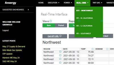
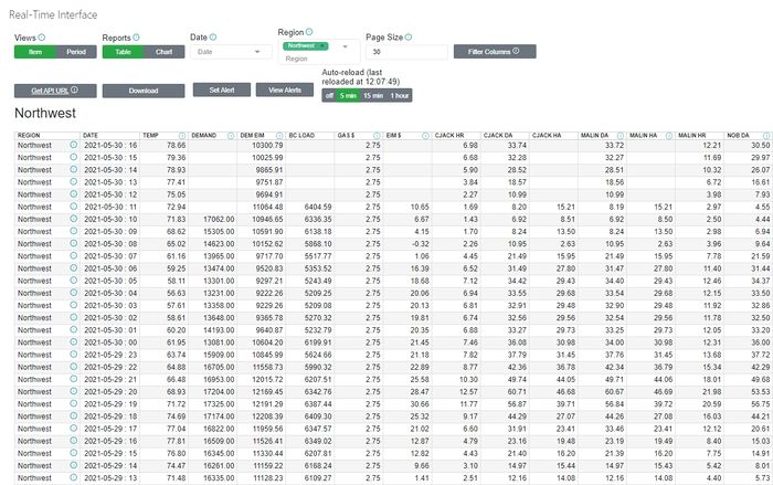
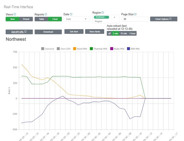
| − | This report | + | This report is an aggregate of all elements/data points that are updated intra-hour within the Ansergy website. There are four reports links on the menu -- Northwest, Southwest, Northern California, and Southern California. Despite having separate menu links, all four reports are housed within the same interface and can be accessed by changing the "Region" filter. |
| − | |||
| − | + | The data can be viewed within a table, or accessed via a chart. Select either with the "Reports" filter. | |
| − | + | [[File:Real Time Table.jpg|alt=Table Depiction|700x700px]] | |
| − | *''' | + | |
| − | *''' | + | |
| − | *''' | + | [[File:Real Time Chart.jpg|600x600px]] |
| − | *''' | + | |
| − | + | == Realtime Reports Options == | |
| − | + | ||
| − | + | ===Views=== | |
| − | + | A view is a way to control what is displayed in the columns - think pivot tables. There are four views | |
| − | + | *'''Hub View''' - all hubs are columns with dates and items as records down; this view is useful for viewing WECC-wide data across multiple date ranges, especially if you filter to a single item. This view is useful for plotting one hub against another when a single item is selected. | |
| − | + | *'''Item View''' - all items are columns with hubs and dates as records down. The Item View is useful for charting two or more items against each other. For example, plotting hydro against demand, or demand against heat rates | |
| − | + | *'''Period View''' - Periods across, hubs and items down. Useful when looking at a single hub to determine changes across time. This view does not plot well. | |
| − | + | *'''Hour Type View''' - Hour Types across (HL, LL or Flat) and dates, hubs, and items down. Useful for comparing the hour types and makes a nice On:Off chart. | |
| − | + | ||
| − | + | ===Reports=== | |
| − | + | The report object allows you to toggle between Data and Chart views. All View controls are available in both reporting types. | |
| − | + | ||
| − | + | As a note, some views chart better than others. By default, the chart will attempt to render whatever was selected in the Report View. If that view is not filtered, the chart will be meaningless, usually. | |
| − | + | ||
| + | ===Date Filter=== | ||
| + | The Date Filter is used to look at one specific period where the available periods are determined by the aggregation level selected. This filter is useful for drilling down to a single period, otherwise the Forecast Interface will display all periods in date ascending order. | ||
| + | |||
| + | ===Region=== | ||
| + | Use this filter to change the data being displayed to either Northwest, Southwest, Northern California, or Southern California. | ||
| + | |||
| + | ==='''Page Size'''=== | ||
| + | By default, the forecast interface will return 30 records. You can display up to 1000 records in a report by changing the page size to 1000. Enter the integer and hit the [ENTER] key. This feature is useful for creating downloads as the number of records downloaded will be set by the Page Size. This filter also controls the size (or length of time) being displayed in a chart. | ||
| + | |||
| + | ==='''Get API URL'''=== | ||
| + | This object generates an API based off the setting that were selected at the time of clicking. The API allows the forecasts to be embedded within a 3rd part application. | ||
| + | |||
| + | ==='''Download Data'''=== | ||
| + | The forecast table can downloaded/exported in two formats. The first allows a user to download exactly what is being displayed in the table, this is signified as "current screen" in the download options. The second allows a user to download according to region where all aggregations are included for Power Price, Gas Price, and Heat Rate. | ||
| + | |||
| + | ==='''Set/View Alerts'''=== | ||
| + | [[TradeRank Alerts]] are often utilized by users that wish to know when Ansergy's forecast, the market price, etc, have reached a desired outcome. When that outcome is reached, an email will be automatically sent to that user's inbox with a notification. A detailed tutorial of how to set and use Alerts can be found on the Ansergy website using this link. | ||
| + | |||
| + | ==='''Filter Columns'''=== | ||
| + | When selecting different views, the number of columns displayed will be a function of the views. The filter will control the contents of the records (rows) but by default you will see all potential columns. For example, if you selected Period View, Month - you would get 300 columns (one for each month of the 25-year forecast). In the hub view, you would see all 52 hubs. In general, a user will want to narrow the amount of data being presented, as such you will use this filter. | ||
== Related Reports == | == Related Reports == | ||
| − | * | + | * Realtime Reports |
| − | |||
| − | |||
| − | |||
| − | |||
| − | |||
== | == | ||
[[Category:Real Time Reports]] | [[Category:Real Time Reports]] | ||
Revision as of 13:00, 30 May 2021
Where
What
This report is an aggregate of all elements/data points that are updated intra-hour within the Ansergy website. There are four reports links on the menu -- Northwest, Southwest, Northern California, and Southern California. Despite having separate menu links, all four reports are housed within the same interface and can be accessed by changing the "Region" filter.
The data can be viewed within a table, or accessed via a chart. Select either with the "Reports" filter.
Realtime Reports Options
Views
A view is a way to control what is displayed in the columns - think pivot tables. There are four views
- Hub View - all hubs are columns with dates and items as records down; this view is useful for viewing WECC-wide data across multiple date ranges, especially if you filter to a single item. This view is useful for plotting one hub against another when a single item is selected.
- Item View - all items are columns with hubs and dates as records down. The Item View is useful for charting two or more items against each other. For example, plotting hydro against demand, or demand against heat rates
- Period View - Periods across, hubs and items down. Useful when looking at a single hub to determine changes across time. This view does not plot well.
- Hour Type View - Hour Types across (HL, LL or Flat) and dates, hubs, and items down. Useful for comparing the hour types and makes a nice On:Off chart.
Reports
The report object allows you to toggle between Data and Chart views. All View controls are available in both reporting types.
As a note, some views chart better than others. By default, the chart will attempt to render whatever was selected in the Report View. If that view is not filtered, the chart will be meaningless, usually.
Date Filter
The Date Filter is used to look at one specific period where the available periods are determined by the aggregation level selected. This filter is useful for drilling down to a single period, otherwise the Forecast Interface will display all periods in date ascending order.
Region
Use this filter to change the data being displayed to either Northwest, Southwest, Northern California, or Southern California.
Page Size
By default, the forecast interface will return 30 records. You can display up to 1000 records in a report by changing the page size to 1000. Enter the integer and hit the [ENTER] key. This feature is useful for creating downloads as the number of records downloaded will be set by the Page Size. This filter also controls the size (or length of time) being displayed in a chart.
Get API URL
This object generates an API based off the setting that were selected at the time of clicking. The API allows the forecasts to be embedded within a 3rd part application.
Download Data
The forecast table can downloaded/exported in two formats. The first allows a user to download exactly what is being displayed in the table, this is signified as "current screen" in the download options. The second allows a user to download according to region where all aggregations are included for Power Price, Gas Price, and Heat Rate.
Set/View Alerts
TradeRank Alerts are often utilized by users that wish to know when Ansergy's forecast, the market price, etc, have reached a desired outcome. When that outcome is reached, an email will be automatically sent to that user's inbox with a notification. A detailed tutorial of how to set and use Alerts can be found on the Ansergy website using this link.
Filter Columns
When selecting different views, the number of columns displayed will be a function of the views. The filter will control the contents of the records (rows) but by default you will see all potential columns. For example, if you selected Period View, Month - you would get 300 columns (one for each month of the 25-year forecast). In the hub view, you would see all 52 hubs. In general, a user will want to narrow the amount of data being presented, as such you will use this filter.
Related Reports
- Realtime Reports
==


