Difference between revisions of "DEMAND CHART"
Jump to navigation
Jump to search
(Created page with " = Where = Main Menu / POWER / BA DEMAND ACTUALS / DEMAND CHART left|thumb = What = * SELECT LOCATION AND CLICK SUBMIT * COMPARE ACTUALS VS PERIOD AVERAGE...") |
|||
| (One intermediate revision by the same user not shown) | |||
| Line 1: | Line 1: | ||
| − | = Where = | + | === Where === |
| − | Main Menu / POWER / BA DEMAND ACTUALS / DEMAND CHART | + | [https://wp.ansergy.com/realtime-demand-chart/ Main Menu / POWER / BA DEMAND ACTUALS / DEMAND CHART] |
| − | [[File:RTDC.png| | + | [[File:RTDC.png|thumb|alt=|none|600x600px]] |
| − | = What = | + | === What === |
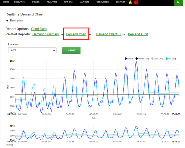
| − | * | + | * Select location then hit submit |
| − | * | + | * Compare actuals vs period average vs daily average vs the 4 year average |
| − | * | + | * Click the colored circle to hide or show data/line |
| − | * | + | * Focus chart - change date range |
| + | |||
| + | ==== Related Reports: [https://wp.ansergy.com/realtime-demand-summary/ Demand Summary] – [https://wp.ansergy.com/realtime-demand-chart/ Demand Chart] – [https://wp.ansergy.com/realtime-demand-chart-lt/ Demand Chart LT] – [https://wp.ansergy.com/realtime-demand-audit/ Demand Audit] ==== | ||
| + | [[Category:Power]] | ||
| + | [[Category:Demand]] | ||
| + | [[Category:BA Demand Actuals]] | ||
Latest revision as of 14:45, 27 May 2021
Where
Main Menu / POWER / BA DEMAND ACTUALS / DEMAND CHART
What
- Select location then hit submit
- Compare actuals vs period average vs daily average vs the 4 year average
- Click the colored circle to hide or show data/line
- Focus chart - change date range
